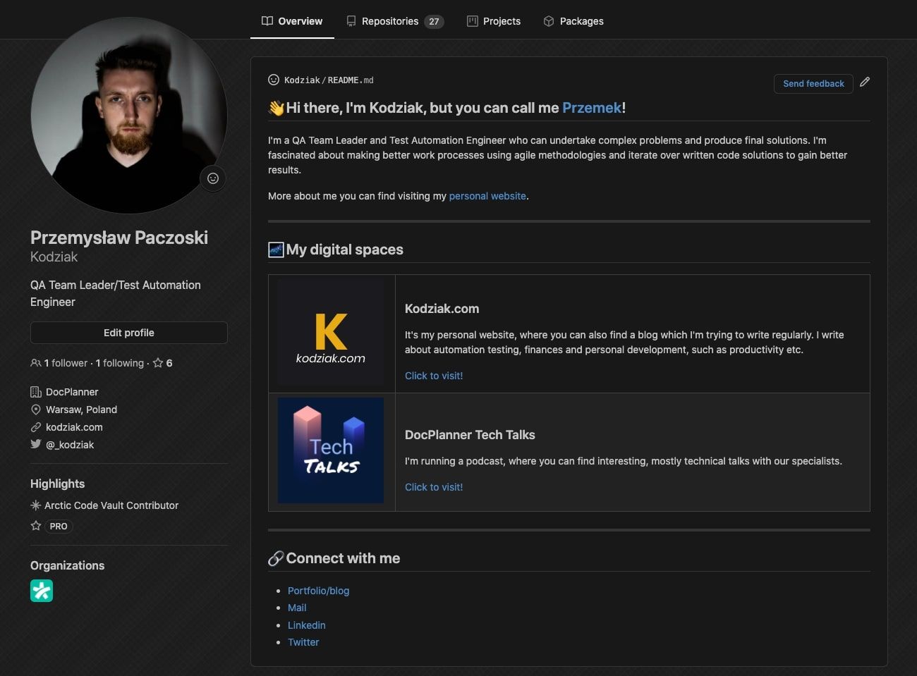
Some time ago I hit an article, that Github added a special type of repository, the ones you see above (we’ll make it better), where we can write something about us. I think, that’s a great idea to show, what exactly I’m doing, and maybe… it could give me some movement to my initiatives?
But there’s one problem. I don’t like writing about me, I just… don’t. I can’t do this right (but I’m writing a blog, huh).
The good one is that Github gave us a basic template, where we just can edit some entries and voila, we’ll have something similar as I have.
If you’re curious how to add this to your Github profile - read the whole article.
How to create your own?
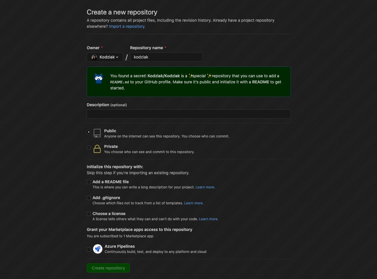
You need to create a repository, but it’s a special type. It has to be named as your GitHub account. So just go to https://github.com/new, same as you’ll have to create a normal repository, and when you’ll type the name of your account (in my case it’s kodziak), you’ll be greeted with a message telling you about this special repository.

Highly recommend setting up this repository as a private to avoid showing a messy/broken page in time you’ll be working on it.
Also, you can initialize base README.md file, which will automatically appear in your profile.
And voila - you have your own page.
Let’s make it awesome
Doing research, I found some nice (nicer than mine, huh) showing pages. So I thought, why not make me more interesting?
I solicited my page into categories. As you may know, I’m also a podcaster (I hope, you know if not, shame on you - I’m kidding), so I’ll go with categories:
- Who am I?
- My core actions (like blog, podcast)
And at the footer - some of my social media, where you can connect and write to me (feel free, I’m always answering!).
Assumptions I go with
I like emojis, so I’ll go with like every header for a specific category that will contain one. I think it’s the way we can add some colors and fun to this text.
But conversely to emojis, I like simplicity, so I thought without adding so many colors, images, gifs, etc, because it just not my style. All the time, I’m trying to keep it simple, to show this nice guy/woman who will come to my profile, as many pieces of information as he/she can get in just a few seconds. Not distracting him/her by jumping ducks.
Another rule I think you should stick is to make it short. No one wants to read long, boring texts (like this one). I’m a fan of short tips and tricks, wherein seconds I can get what I wanted - so I’m tried to keep my page in this style.
Conclusion
Make it fun, simple, and short. But make it. I could help you.
I hope, this article gave you knowledge on how to set up this and inspiration how can you improve (setup?) your page. If yes - feel free to write to me with a link, I’ll put it there!
Feel free to write to me with any topic 😇
Have a nice day!
In case you need inspiration, there are some interesting ones: